Monday 3 March 2014

Peckham Meets Indian Culture.

This three week project was also another topic I found to be quite exciting and fun, when it came down to the development of the work and experimenting with pattern and repeats.  I went out to find two concepts which would work together in some form to create one project. So I thought it would be much more interesting to find two concepts that were in contrast to each other, i took myself to a local area i find most fun and exciting yet is looked upon as quite a rough area a lot of gang formations and a place you wouldn't see yourself walking alone at night. However i tried to highlight Peckham in its positive lights and show that it isn't at all like this but full of culture and vibrance, a place which emits atmosphere and a community. Especially with its massive fish and meat markets oozing with colour as well as the endless amounts of fruit and vegetable stalls which take over most of Peckham. I took many primary photos of the area and also photos i had taken from Peckham on nights out where it is a fantastic night life for going for cocktails with your friends and local hidden clubs which are packed full with students from around south London. I mainly focussed on the train station as from time to time i always travel from Peckham to central London and find its station the main meeting point it has a beautiful feel to it form the symmetrical circular windows and the old brick which formulates the building. I also zoomed into key detail of the metal works which are the detailing around the windows of the station and used this as the key element to my digital prints. Another link i took form Peckham was the amount of hair salon shops that are com packed tightly next to each other row after row, i took the glitzy side of Peckham and picked part of a sign which incorporated sparkles and put this onto photoshop with the metal works from Peckham rye train station. I produced five digital prints from this, i got so carried away with focussing on the Peckham side i didn't manage to make a contrast with a different concept which i thought to be quite disappointing with myself. But however my prints came out successfully and so i carried the indian culture project out as a separate one.

It may have been a lot more interesting if i had interlinked Peckham and indian culture in some way, this could have worked if i had had another week to try and conjoin them in some way, but i didn't have enough time. So i decided to take the indian culture project and do the same as i did with the Peckham one i took elements on middle eastern jewellery from the British Museum and focused on intricate detailing of a specific piece of jewellery and experimented with my observational drawings repeating them and focussing on how i could possibly make this into a pattern if it was for an interior design, with the help from Daniel a tutor who worked with us on how the eye focusses on certain points of a piece when the eye leans more towards colour on a pattern and how to balance out a piece of work. This was a great technique learnt as now when it comes to creating a pattern i will focus more on layout and what works well when it comes to layering for example. I then scanned in my print and manipulated it on photoshop to create five different digital prints this was the most exciting bit of the project i have found something i never thought i would love so much, but the out comes were great and i adapted them to garments if they were put forward for fashion design prints.

Here are some images below of my Peckham project and culture project.


Sports Wear Project.

This has to be one of my most enjoyable projects yet. One of the reasons being is because i am a sucker for sports wear labels especially when it comes to vintage classics like Nike and Adidas for example. For this two week project seeing as it wasn't a very long assignment, i had to conjure up two main ideas which i would work with and finally produce an end out come - which was Digital Prints.
my idea generated from my research into colours, textures and fabrics which are currently in season for sports wear so this was colours like nyons bright yellows and pinks - all taken from companies like Nike Town and Trainer shops on oxford street like Office and OffSpring. Aswell as Electric blues and greens, i also made sure i researched into fabrics as to what was currently popular when reverencing sports wear and fabric, this happened to be Air-Tex a criss crossed fabric that normally is used for basket ball players or football sports wear. So i wanted to work with a palette of nylons and airtex, but i had to find my other side to my project which would contrast to what ideas i had for colour and texture. I decided to head up to the science museum in sight of inspiration for an idea, i thought of looking at the human brain where i produced a few observational drawings as well as taking photographs within the museum of real life contained brains. 

Further into my research i took my sports inspiration of basketball and focussed on numbers within sports wear for example like massive imprinted number fives which resemble the number of the sports player, then linking this to my human brain idea. By taking my pictures from the science museum and playing around on photoshop i used the magic wand tool and highlighted the brain cortex structure rather than the whole brain itself. Manipulating colour so i could branch right out of my comfort zone, initially i didn't quite like the colours as they personally were not something i found most appealing but the idea was that i could play around and experiment with colour from the brain cortex as well as putting the number five i had taken a picture of and manipulating it into a digital design. I produced seven digital sports prints from this project and thoroughly enjoyed working with my ideas. Even though i didn't quite like my designs at the beginning as i thought they were to basic and bland the more i experimented on photoshop with my photography the more i seemed to enjoy and like my work. I think my concept worked well because i had two ideas linked together which initially were quite contrasting.


Sunday 12 January 2014

Reconstruction & Deconstruction.

After the christmas holiday peeriod, a project was set out to research and gather materials for the concept of - Reconstruction & Deconstruction. Exploring various charity shops for clothes that where to do with, knit, evening wear, sports wear, Casual wear & tailoring. I picked various old clothes of mine which contained alot of lace on some some of my chosen garments aswell as picking knit wear from a charity shop which had quite alot of texture to it. I thought this would be quite experiemtnal and intersting to work with. Students where then asked to record and develope at least 20 design ideas using the bought garments and to then produce some developed and changed pieces of outfits deconstructing the garments and reconstructing them afterwards. For example parts of the sports wear connected with evening wear onto a manikin. This was exremeley enjoyable as playing around with all the clothing was most exciting unpicking shorts and making it into sleeves or a boobtube with cut lace from the evening wear. Aswell as experimenting with colour and seeing what works well togther, as I seemed to have a lot of navy wear. The pictures below represent my sketch book work and my design ideas for each of the cut garments I reconstructed togther. 


Another task given was to produce some cut out collages of our scanned in charity shop deconstructed garments and create unsual cut out shapes which didnt represent anything in particula. I produced these cuttings by joining the seam lines and other lines resembled by folded shapes creating the most bizzare outlines. These five images below are from my sketch book.


Monday 18 November 2013

Photo Shop - Digital Print Design, Week Three - Fashion & Textiles.

This week consisted of working with photoshop. In a way I was dreading this as I have never used photoshop before, so did struggle quite a bit. However the outcome and things I learned with pattern layering and using cloning tools to manipulate a pattern onto a garment I found extremely interesting and had a huge range of different ways of changing the pattern we all created. For example changing the opacity and the highlights of colours ect. I based my pattern around my Image I picked from my mood board, which was a pastel coloured egg shells. Many steps i learnt and should hopefully be using them in some of my work through out this year or possibly next year when it comes to digital design. 


Second week of Fashion & Textiles.


My fashion Shoot.

Part of a set project following the theme of styling. We were told to produce and create our own photo shoot based around our own identities, coming up with a mood board for each section of - Location, Style, Hair & Theme. This was brilliant, as we could decide on colour and how we wanted to portray ourselves through creating a collection of images based on out selfs. My shoot embodied the theme sports wear, basing around Adidas as that is a key element to myself, I always seem to have an attraction to vintage sportswear always incorporating it with my everyday wear. I also find myself drawn towards pastel coloured garments especially baby pinks, and candy floss shades. I also tried to manipulate this as representing even though i am quite sporty, sheerness and sophistication I find most appealing to. I thought i would use myself to model as it was representing me as a person, not that I have modelled before I did actually find it enjoyable and the pictures came out successfully. Luckily I had a happy mistake of the pictures coming out quite distressed looking as the ink had run out slightly on black, even so I thought it worked well. Here are the images of my photo shoot below.


Knitting

This was a great experience, as it is something i have never done before and was keen to try it out. At first it looked extremely technical as the actual machine had loads of different components and parts that had to be put in place before you could begin. Once i got the hang of it I found it very relaxing and easy to do, however i did from time to time make a couple of errors, and had to re fix my machine learning and remembering If I had threaded my yarn correctly ect. We made a couple of samples using some techniques like Lace, Honey comb which you can see with the video I have put up by our teacher. I really enjoyed this task, as it was a relaxing and handy technique which could make a garment or design more interesting by adding knit. Unfortunately I didn't get to make as many samples as i wanted to, as we had such a big group, so i shared my machine. It was interesting however working with a partner as we both helped each other If we made mistakes. The samples I produced where quite textured and not symmetrical or followed a carry on pattern, In a way this was good as my teacher said It showed uniqueness and a range of texture. 


Wednesday 30 October 2013

Fashion&Textiles - Styling and Photography.

Our first day of Styling and Photography, I was keen to get started on this as I  have always been very ambitious when it comes to mixing and matching clothes. Im always considering what i think looks good and what people suit ect, i can't seem to help it. Doing this was a treat, we were asked to bring in some old clothes of ares that we didn't mind styling students in for a photoshoot.  We were also asked to bring in a collection of Photo Booth photos of ourselves emitting our personalities in different ways. This was a fun challenge as i tried to capture the humorous side of me and the charismatic side of me. I also did a eccentric posed side as everyday life seems to be about what looks good, and how people present themselves to looking good, i.e over Facebook, Instagram, twitter this was asked to be done as part of our projects outside of Ravensbourne is to produce our own photo shoot evoking ourselves for example clothes that represent us and the location and colour we choose has characterise us in some way. 

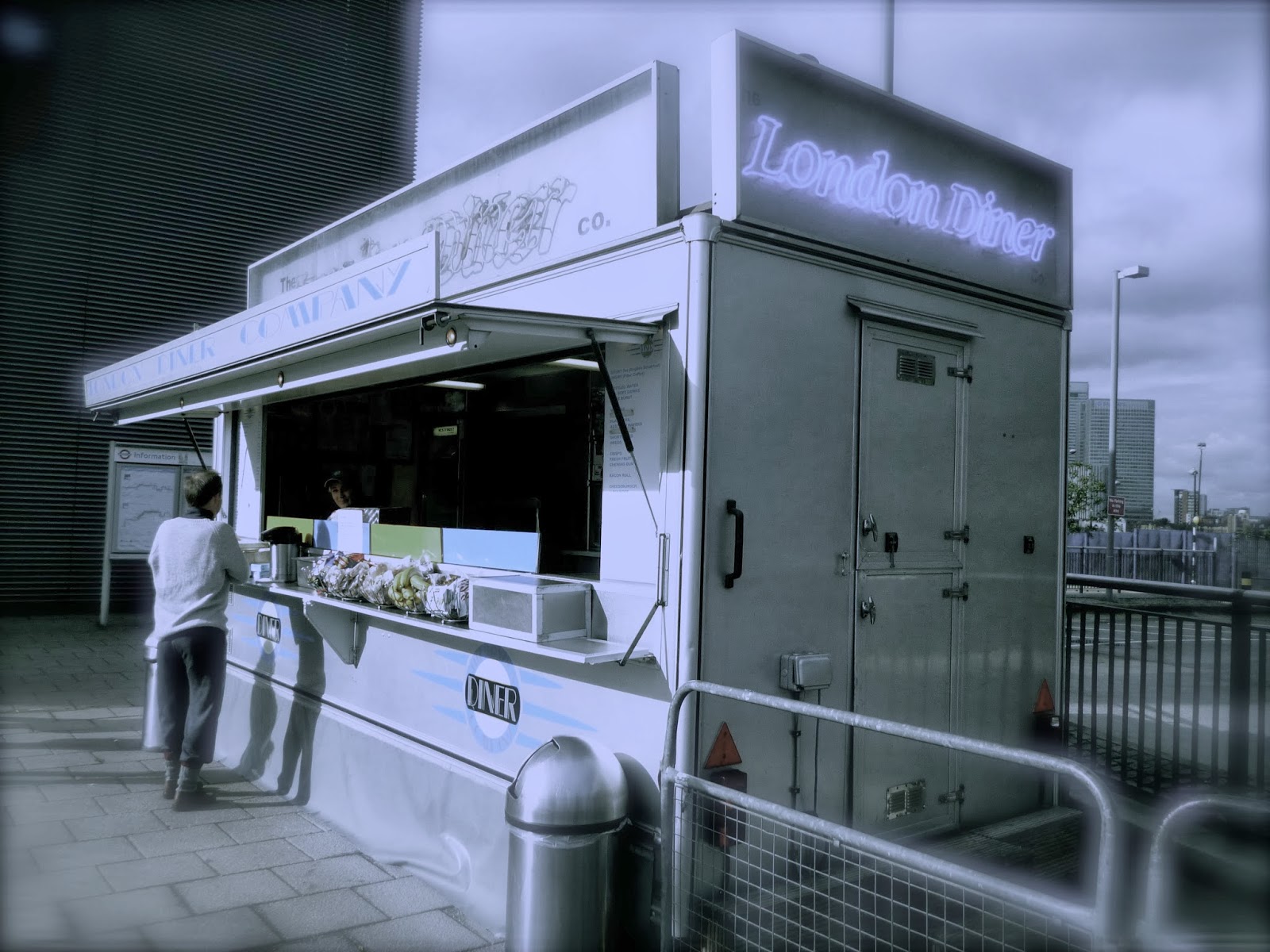
Firstly we were sent out to discover locations we thought fit for our photo shoot, being surrounded by the o2 arena and building sites we had a very good opportunity in finding some good places to use as a location photo shoot. This was a great task engaging with other students and taking in other peoples opinions on what they thought would be good, or what they didn't think would be good i.e just shooting it on some grass with an old lamp post on the side, would be boring. Most of us found some interesting places and took some snaps, below our some of my pictures i had taken and edited as if i was going to use them for a location fit for my shoot, depending on the concept.


After doing this, we were told to get into pairs and style one another having only five minutes each using the clothes we had brought in. This was quite a challenge as we had such little time to come up with an outfit. However saying this, it worked really successfully once we all started everybody got into the flow of things and went extreme with the way we used the clothes to fit each of us. This was a very exciting task and i let loose, not caring about what look hot, or pretty, but what look the most extravagant and adventurous I thoroughly enjoyed this task. After this we put ourselves into groups of four and went round the building finding spaces to shoot each other in, we mixed and matched clothes and styled our colleagues, yet again i really enjoyed this task, especially the editing of the photos and styling.


This was a new experience and exciting project overall. 

Our next task was to produce five mood boards for our own photo shoot styling project on our identities. This had to include Location, Hair, Makeup, Stlye & poses to show mood/ attitude swell as props.